I’ve always been interested in understanding images. From how images are formed to how we can get machines to understand images in similar manner to the average human being. It is helpful that our visual world is rich and that images can capture so much information due to their high dimensionality.
The key word here is “visual”. Human beings are visual creatures. We rely on our eyes more than we would like to acknowledge for multiple tasks (as seen via various sight related idioms). As I delve into more areas of Computer Science, the use of data to accomplish superhuman feats is ever growing. Deep Learning for one is a new field that has tremendously tapped into these enormous collections of data to produce computational models with astounding capabilities. However, to better understand what models can be trained, many researchers recommend visualizing the data, again iterating the first line of this paragraph. Thus to marry the two above ideas, I decided to make my life easier by exploring some data visualization and explain why fundamental data viz is a highly useful and rewarding skill to have.
For my tooling, I use the well-designed and utilitarian Data Driven Documents or D3 library. Of course, I could have used other libraries such as Bokeh (Python), but D3 has a lot of great features that overshadow the fact that it is written in Javascript (ughh). For one, D3 directly renders to HTML rather than generating intermediate JS or images, making the visualizations super interactive. Moreover, D3’s idiomatic approach is what won me over. Loading, filtering and manipulating the data is done asynchronously in a systematic and declarative fashion, saving me a lot of headache. Finally, D3 has the amazing bl.ocks.org, maintained by D3 creator Mike Bostock (who has a PhD in Data Visualization from Stanford, by the way) and Mr. Bostock also write fantastic tutorials which use D3 and explain its capabilities.
Now for the actual goodness. Since we have more readily accessible datasets, visualizing them helps us to leverage our “visual creatures” persona to better understand them and leverage their latent information. For example, I created this amazing word cloud using D3, reading in the text of Andrej Karpathy’s excellent article on what it means to get a PhD:
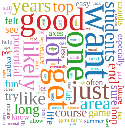
All of a sudden, you understand the key themes of his article even though you may not have read it, not to mention this looks super cool! This is the power of data visualization and a key proponent of my belief that data viz is a useful and rewarding skill. You can take a look at the code on my block, or fork it and add your own text corpus.
I did mention interactivity didn’t I? That word cloud may not be interactive, but this plot sure is. That is nothing but a plot of the 1024 dimensional vectors generated from a Convolutional Neural Network on a Geolocation dataset, where the idea is to train a model to predict the location where the image was taken by having the model look only at the image. If you’re confused about how I managed to plot a 1024-D vector in 2-D space, then I would recommend taking a look at the fabulous t-SNE algorithm and the open source implementation of the faster Barnes Hut t-SNE algorithm available from the inventor himself (if you look closely, you may see my name in the list of contributors 😉 ).
Another cool example is that of choropleth’s or heat maps as they are commonly known. Mike Bostock has some amazing visualizations using choropleth’s on a simple statistic such as census data which I highly recommend taking a look at, amidst his other gorgeous visualizations. I personally plan to use choropleths to visualize some of the geolocation datasets I am playing around with.
Some visualizations you might start off with if data viz is new to you is stock market prediction. You can pick up the data from Yahoo Finance and then with the power of D3, you could quickly just see how a particular stock has been performing over weeks, months, or even years. Kind of nice, compared to staring at all those floating point numbers without too much trouble either.
Overall, I hope via these simple examples, I have demonstrated the inherent power and usefulness of data visualization and how it can help tackle some of more challenging problems which our society faces. Now go out there and visualize some greater good!
